




 Home
Home
 City Wise Admissions
 Level wise Admissions
 Category wise Admissions
 Popular Admissions

Admission Open in Bahria University Karachi
Posted Date
Last Date
City



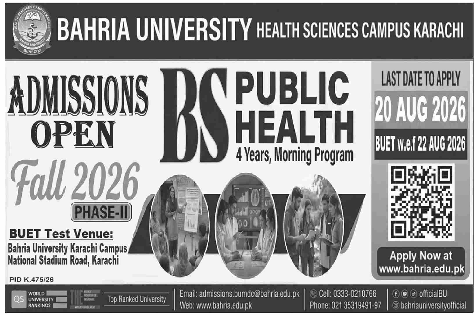
This is a targeted admissions announcement for the BS Public Health (4-year Morning Program) at Bahria University Health Sciences Campus Karachi. Unlike the previous general postgraduate ad, this one focuses on a single undergraduate program. It uses a clean, modern design with prominent visual cues (rankings, badges) and a clear call to action, emphasizing the application deadline of 20 August 2026 for the Fall 2026 Phase-II intake. The ad balances institutional prestige with practical application details.
Detailed Format Breakdown
1. Header: Institutional Branding (Top Section)
-
Text:
-
HEALTH SCIENCES CAMPUS KAI (Likely truncated in the original text; intended to be "Karachi")
-
BUHSCIKI (Acronym for Bahria University Health Sciences Campus Karachi)
-
BAHRIA UNIVERSITY HEALTH SCIENCES CAMPUS KARACHI (Full name)
-
-
Format: Bold, prominent display at the top. The acronym is emphasized for brand recognition. The full name provides official clarity.
2. Headline & Program Information
-
Text:
-
ADMISSIONS OPEN (Primary headline – large, eye-catching).
-
BS PUBLIC HEALTH (Program name – bold, distinct).
-
4 Years, Morning Program (Duration and timing – smaller subtext).
-
-
Format: Hierarchical layout. "ADMISSIONS OPEN" is the largest element to create urgency. The program name is clearly separated for instant readability.
3. Key Dates & Logistics (Urgency Section)
-
Text:
-
LAST DATE TO APPLY: 20 AUG 2026 (Bold, prominently placed).
-
BUET w.e.f: 22 AUG 2026 (BUET = Bahria University Entry Test, "w.e.f" = with effect from).
-
BUET Test Venue: Bahria University Karachi Campus, National Stadium Road, Karachi.
-
-
Format: Visually separated, often inside a box or shaded area to stand out. The deadline date is emphasized with a different color, bold font, or large size to create urgency. The test date and venue follow logically below.
4. Visual Credibility Indicators
-
Text/Badges:
-
Top Ranked University (Text badge).
-
QS (World University Rankings logo/badge – indicates international ranking).
-
-
Format: Displayed as small graphic badges (likely with stars or logos) near the top-right or bottom-left. Yellow/orange and blue colors are commonly used to make them pop against the background.
5. Call to Action & Website
-
Text:
-
Apply Now at www.bahria.edu.pk
-
-
Format: A prominent button-style text or hyperlink. The phrase "Apply Now" is likely in a contrasting color (e.g., orange/yellow) and bold font to drive immediate action. The URL is clearly written to facilitate quick web access.
6. Contact & Accessibility Information (Footer)
-
Text:
-
Email: admissions.bumdc@bahria.edu.pk
-
Web: www.bahria.edu.pk
-
Cell: 0333-0210766
-
Phone: 021 35319491-97
-
-
Social Media Icons/Handles:
-
@officialBU (Facebook handle)
-
@bahriauniversityofficial (Instagram handle)
-
-
Format: Placed at the bottom in a smaller font size. Contact details are listed horizontally or in a compact grid for easy scanning. Social media handles are accompanied by icons (Facebook/Instagram logos) to direct users to their digital presence.
7. Administrative/Footer Details
-
Text: PID K.475/26 (Advertisement tracking/reference number).
-
Format: Small, fine-print text at the very bottom. This is a standard requirement for government/educational advertisements for official tracking purposes.
Summary of Stylistic Choices
| Element | Stylistic Choice |
|---|---|
| Color Palette | Likely Blue (primary), White (background), and Yellow/Orange (for CTAs and ranking badges). Professional and energetic. |
| Typography | Bold sans-serif fonts for headlines and key dates to maximize readability. Smaller sans-serif for contact and footer details. |
| Hierarchy | 1. ADMISSIONS OPEN (Most prominent – grabs attention). 2. Program Name & Deadline (What & When – key decision-making info). 3. Test Venue & Apply Button (Where & How – action-oriented). 4. Contact & Social (Supporting info). |
| Visual Weight | The deadline (20 AUG 2026) and the "Apply Now" call-to-action receive the most visual emphasis to convert interest into action. |
| Tone | Professional, modern, and student-centric. The use of rankings (QS, Top Ranked) and clear logistics builds trust and simplifies the application process. |
| Legibility | Essential information (dates, website, phone numbers) is isolated and easy to find, allowing quick reference without scanning long paragraphs. |




Share your comments & questions here
No comments yet. Be the first to comment!